TL;DR: When your website demands too much mental effort to read and understand, visitors experience Cognitive Load. This mental exhaustion is the silent killer of B2B sales, directly resulting in Low Website Conversions. To fix this, you must ruthlessly simplify your design — and your copywriting — so buyers can find exactly what they need in seconds.
Imagine someone landing on your website right now.
They’ve got a real problem to solve, 15 minutes to make a decision, and three+ tabs open to your competitors.
As they start scrolling they’re immediately hit with a dense, 7-line paragraph of industry jargon, there’s an image slider moving too fast, three to five different CTA buttons screaming “Click Me,” and a pop-up asking them to subscribe to a newsletter.
Oops, guess what just happened? They closed the tab and forgot you forever.
This is a common problem with B2B websites, where unchecked cognitive overload actively drives qualified leads straight to a competitor with a simpler website.
What is Cognitive Load?
In UX and psychology, cognitive load refers to the amount of working memory resources used by a person at any given moment.
For your B2B website, it’s the mental effort required for a visitor to read your copy, process your layout, understand what you sell, and figure out what to do next.
If we break it down, there are two main types you need to manage:
- Intrinsic Cognitive Load: The natural complexity of what you are selling. B2B software, logistics, and enterprise services are inherently complex.
- Extraneous Cognitive Load: The way you present that information. This is where most websites fail due to messy design, jargon-stuffed paragraphs, and chaotic messaging that artificially inflate the mental tax on your reader.
You can’t do much about the intrinsic complexity of your industry, but you are entirely in control of the extraneous load. When you fail to manage it, you create a massive barrier to entry for an audience that is already stretched thin.
How Mental Overload Sabotages Your Sales Process
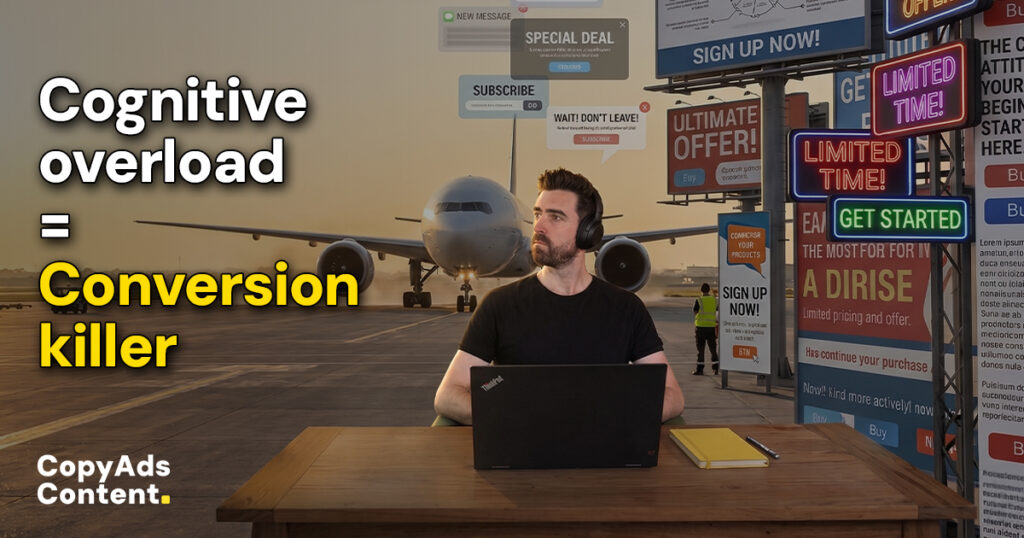
Imagine trying to negotiate a complex B2B contract on the tarmac of a busy airport with jet engines screaming overhead. To get anything done, you only have two choices:
- Move the meeting far away from the traffic
- Invest in a pair of heavy-duty noise-canceling headphones
In both scenarios, the outcome is the same — you are actively blocking out the sensory overload to get back to a functional baseline of focus.
Your B2B buyer is experiencing the digital equivalent to being on that tarmac. When cognitive load is too high, their brain chooses the path of least resistance: escape.
According to UX studies from Google, users form a judgment about your website in just 50 milliseconds. Their findings show that high visual and textual complexity directly correlates with a lower perception of trust.
In other words:
Highly complex, overwhelming websites are instantly perceived as less beautiful and less trustworthy.
Research from the Nielsen Norman Group also reveals that exceeding a visitor’s working memory directly leads to friction and task abandonment — most notably when it comes time to fill out your lead forms. If requesting a demo feels like taking a standardized test, they are very likely to bail.
Drawing on cognitive load research, there are four known principles that consistently reduce friction:
- Structure: Create a ruthlessly logical path to the finish line. Break intimidating walls of text or massive lead forms into digestible, step-by-step chunks so the buyer never feels overwhelmed.
- Transparency: Set clear expectations upfront. Tell the buyer exactly what happens when they click “Book a Demo” or “Download” so they aren’t anxious about being trapped in an endless sales cadence.
- Clarity: Eradicate ambiguity. Use simple, precise language so your visitor never has to guess what a button does, what a form field requires, or what your product actually means.
- Support: Anticipate their friction points. Use strategic microcopy (short, helpful text near your forms or CTAs) to answer objections and guide them smoothly through the conversion process.
But clarity is only half the battle; the other half is volume.
Take everything you just read about mental fatigue and multiply it by Hick’s Law. This foundational UX principle dictates that the time it takes for a person to make a decision increases logarithmically with the number and complexity of choices in front of them.
When a buyer can’t figure out your value proposition within five seconds, the mental tax simply becomes too expensive to pay.
The direct result of this frustration? Sky-high bounce rates and plummeting website conversions.
Minimizing Your Website’s Cognitive Load
Buyers are demanding frictionless experiences. McKinsey’s 2024 B2B Pulse survey found 54% of buyers likely to switch suppliers cite poor digital experiences as the reason.
Today’s buyers prefer a self-guided journey, which means your website must be simple, easy to navigate, and deliver information with absolute clarity. This also means your sales rep is removed from the equation, forcing your website’s copy to do all the heavy lifting.
Here are some modern strategies for minimizing cognitive load to keep visitors engaged and moving toward a conversion:
Cut the Visual and Verbal Clutter:
Meaningless corporate jargon and crowded design elements force your visitors to work entirely too hard.
- Kill the jargon: Replace buzzwords like “synergistic paradigm shifts” with a clear, direct explanation of exactly what you do.
- Break up text walls: Keep sentences short and paragraphs to three lines or fewer.
- Format for skimmers: Use bolding and bullet points to naturally guide the reader’s eye to your most critical benefits.
- Ditch the filler: Remove redundant links and irrelevant stock photos that add noise without actively selling your service.
Build on Existing Mental Models
People already expect websites to behave a certain way based on thousands of prior visits. Don’t reinvent the wheel—lean into their habits to reduce the learning curve.
- Stick to standard layouts: Place your logo in the top left, your navigation at the top, and your primary Call to Action (CTA) in the top right.
- Use expected labels: Choose clarity over cleverness. Label your menu with “Pricing” instead of vague terms like “Investment Opportunities.”
- Prioritize familiarity: By using recognizable structures, you allow the user to stop thinking about how to use your site and start thinking about your offer.
Offload the Mental Heavy Lifting
Never require a visitor to memorize information or process complex decisions all at once.
- Use progressive disclosure: Hook them with the high-level benefit first. Provide a button for the deep technical specs rather than dumping them all on the homepage.
- Adopt the “One Page, One Goal” rule: Never ask a user to book a demo, subscribe to a newsletter, and download a whitepaper at the exact same time. Give them one clear next step per landing page.
- Summarize feature lists: Transform dense, manual-like feature dumps into quick, scannable bullet points so their brain can process the value immediately.
Ready to Lighten the Load?
A buyer’s attention is a precious resource, and as a B2B brand, your copywriting and design must allocate it carefully.
If your website traffic is high but your conversions are flat, your buyers might not be rejecting your offer — they may just be rejecting the mental effort required to buy it.
To become the obvious leader in your industry, you need messaging that gets straight to the point, paired with a user experience that kills the friction.
That’s exactly the kind of work I do.
As a copywriter with web development skills, I don’t just write the words that sell; I build the cognitive-friendly, high-converting websites that B2B services like yours need to turn traffic into revenue.