TL;DR: Unclear website messaging is a positioning problem, not a writing problem. B2B buyers decide in 5 seconds whether to stay or bounce, and 95% buy from their Day One shortlist. If your site is too vague to make the list, rewriting won’t save it unless you fix the positioning first.
Imagine a B2B buyer has just performed a high-intent Google search to solve a burning operational bottleneck. They open your homepage alongside seven other tabs from your direct competitors. They are not reading; they are hunting. They give your site exactly five seconds to answer three basic questions:
- What do you do?
- Who is it for?
- Why should I care?
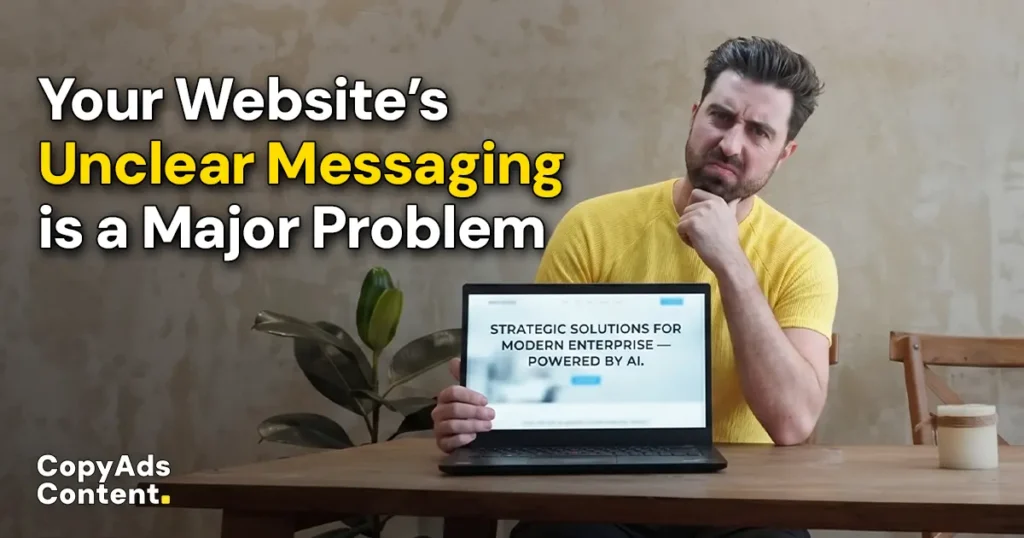
If your hero section reads like a soup of corporate placeholders — something like “Leveraging strategic solutions to optimize modern enterprise synergy” — they don’t pause to decode it. They close the tab and consider a competitor.
You might instinctively assume this is a copy problem. You look at your bounce rates and think, “We just need a punchier copywriter.” But you cannot rewrite your way out of unclear positioning. Vague website messaging is simply a writing symptom of a much deeper strategic disease.
As globally recognized B2B positioning expert April Dunford frequently highlights, your positioning is the absolute foundation of your sales pitch. When your website copy is built on vague abstractions, it doesn’t support your sales process—it actively sabotages it. Your reps end up spending the first half of every discovery call trying to undo the prospect’s confusion and clarify what your product actually does.
Your website shouldn’t be an obstacle your sales team has to apologize for or correct. It should be doing the heavy lifting before a call is ever booked.
The Cost of Confusion (Backed by Data)
When you publish a landing page with unclear messaging, you aren’t just offending copywriters; you are actively draining your revenue pipeline.
Recent enterprise data shows that the modern B2B buying journey has radically shifted toward an autonomous, self-directed path where your website acts as your primary Closer.
1. The 10-Second Filter
According to user experience research by the Nielsen Norman Group (NN/g), users form a first impression of a website within mere milliseconds, but they typically decide whether to stay or leave a page within 10 to 20 seconds.
If you want a prospect’s attention for longer than that, you must communicate your core value proposition within that initial window. If your site fails the informal “5-second test,” you are paying to drive traffic that immediately bounces.
2. The Dark Funnel Shortlist
Data from 6sense’s B2B Buyer Experience Report reveals a stark reality for vague websites: buyers delay contacting a vendor until they are roughly 61% to 69% of the way through their total buying journey.
By the time a prospect actually initiates outreach, they have already independently established their purchase requirements and built a mental shortlist of preferred vendors.
In fact, 6sense found that 95% of buyers ultimately purchase from a vendor that was on their “Day One” shortlist. If your website copy is too abstract to land you on that initial list, your sales team won’t even get the chance to pitch.
3. “Value Clarity” Dictates Deal Size
Gartner research highlights that winning a high-intent B2B deal requires what they call Value Clarity—a buyer’s explicit understanding of how a solution improves outcomes for their specific role and business context.
Buyers who achieve value clarity early in their digital research are twice as likely to report a high-quality, high-dollar deal compared to those forced to navigate a confusing, low-confidence buying experience.
The Qualitative Smoke Detector: “Sales Correcting the Website”
While the quantitative data from Gartner and NN/g paints a grim picture for the balance sheet, the sharpest qualitative signal of broken messaging happens right on your discovery calls.
When your digital footprint is ambiguous, inbound prospects arrive misaligned.
Instead of diving into a high-value strategic conversation, your sales reps are forced to burn the first 15 minutes of the call playing defense—correcting basic misconceptions, explaining what the product actually does, and filtering out completely unqualified leads.
If your reps are constantly opening calls with, “Let me back up and clarify what we actually do,” your website is actively introducing friction that elongates your sales cycles and drags down close rates.
Most founders reading this think their copy is the exception. It almost never is. You’re too close to it to see what your buyer sees.
Real-World Teardowns of B2B Websites with Unclear Messaging
To understand what value clarity looks like, we have to look at how successful B2B brands transitioned away from abstract category statements and into hyper-focused positioning.
Harry Dry’s 3-Part Fluff Filter
To audit whether your messaging is positioning or just marketing fluff, run it through the framework popularized by Harry Dry of Marketing Examples:
| The Fluff Test Question | ❌ The Bad Fluff | The Good Positioning |
| Can I visualize it? | “Streamlined workflows for modern teams.” (No visual context) | “AI that catches billing errors before invoices are sent.” (Highly visual) |
| Can I prove it true or false? | “We help businesses grow.” (Unfalsifiable; everyone claims this) | “We book qualified sales meetings with cybersecurity executives.” (Falsifiable) |
| Can a competitor copy paste this? | Yes. Every B2B SaaS on Earth uses this language. | No. Only a highly specialized vendor can back this claim up. |
Case Study: Loom
Image Source: Wynter
- ❌ The Before (Abstract Category): Early on, Loom leaned into high-level, generic hybrid-work messaging, framing itself broadly as “an essential tool for the modern workspace” or using taglines like “Show it, say it, send it.” While catchy, any communication tool on earth could claim to be an “essential workspace tool.”
- The After (Sharp Positioning): “Loom on. Meetings off.” They backed this headline up with a concrete metric: “Get 29% fewer meetings.”
- Why it works: They stopped describing the mechanics of video recording and focused entirely on the alternative they were replacing: painful, calendar-clogging meetings.
Case Study: Zuko (Form Analytics Software)
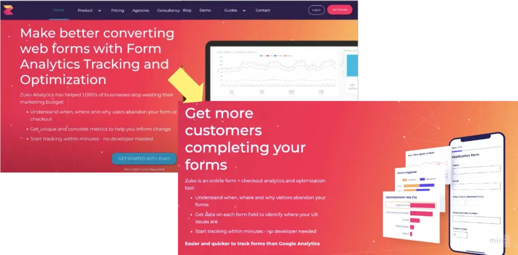
Image Source: Wynter
- ❌ The Before (Feature-Heavy Jargon): Zuko’s early homepage was cluttered with technical explanations of form analytics mechanics, paired with an unprovable corporate promise of “reducing marketing budget waste.”
- The After (Outcome-Driven): “Get more form submissions.” They cut the fluff, changed their headline to a direct consumer outcome, and paired it with a clean screenshot of the actual product UI.
- Why it works: B2B buyers don’t wake up wanting “form analytics platforms”; they wake up wanting more people to complete their checkout or signup forms.
The 3-Layer Solution Framework
If your website is failing the 5-second test, do not open a blank Google Doc and start tweaking adjectives. Follow this strict, top-down prescription.
Layer 1: Positioning First (Before Any Writing)
Before a single word is typed, you must gain absolute clarity on four foundational business metrics:
- Who specifically is this for? (Not “businesses.” Define the exact role, company size, and specific situation—e.g., Head of People at mid-market tech companies scaling from 100 to 500 employees).
- What acute problem do they have right now? What pain point triggered their Google search today?
- What is the alternative they are comparing you to? (Including manual spreadsheets, hiring an intern, or simply choosing to “do nothing”).
- What do you do that the alternatives cannot touch?
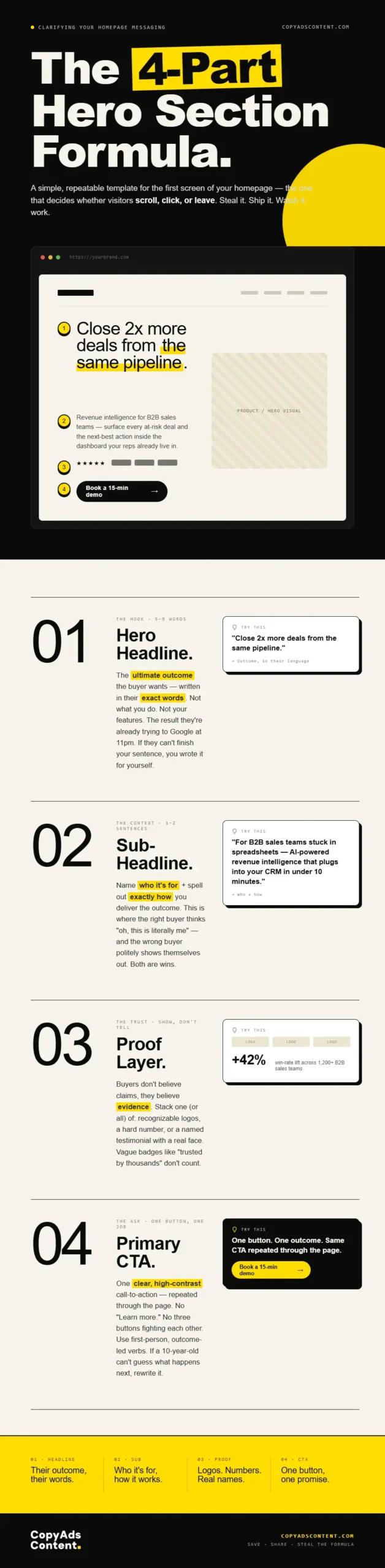
Layer 2: Establish the Message Hierarchy
Once the positioning is locked, map your homepage hero section using a strict structural template designed for the skim-reader:
- HERO HEADLINE: The ultimate outcome the buyer wants, written in their exact words
- SUB-HEADLINE: Who specifically it is for + exactly how you deliver that outcome
- PROOF LAYER: Recognizable logos, data-backed results, or a named testimonial
- PRIMARY CTA: One single, clear, high-contrast call-to-action repeated throughout
Layer 3: The “Sales Call Test”
Read your homepage copy completely out loud. Ask yourself: Would my top sales rep ever say these exact words to a living, breathing prospect on a discovery call?
If a human being would sound ridiculous saying it out loud, it is marketing-speak. Rewrite it until it sounds like natural, professional human conversation.
B2B Messaging Anti-Patterns to Delete Immediately
Audit your current site right now and purge these conversion killers:
- “Solutions” as a noun: If you describe your company as an “enterprise software solution,” you have said nothing. Tell the user exactly what the software is (e.g., automated payroll software).
- The “We help businesses…” opener: This is a flag of weak positioning. If you help all businesses, you help no one.
- Adjective Stacks: Stringing together empty descriptors like “innovative, robust, cutting-edge, results-driven, and seamless.”
- Literal Cliché Graphics: Hero images featuring generic corporate handshakes, standard stock laptops, or pixelated cityscapes. If your image doesn’t provide product or service context, delete it.
- The Triple-CTA Paradox: Placing three competing buttons side-by-side in your hero section ([Get Started] [Book a Demo] [Learn More]). This forces the buyer to map their own journey. Pick the single most effective action and stick to it.
Make Your Website’s Messaging Crystal Clear
If your homepage fails the 5-second test, no amount of rewriting will save it. You’ll just produce clearer versions of the same vague claim.
The fix runs in this order: positioning, then message hierarchy, then copy, then design.
Most agencies run it backwards — pretty layout first, words last — which is why the rebuild never actually fixes the problem.
At CopyAdsContent, I work the order in reverse: nail the positioning, map the message hierarchy, then let the words dictate how the page gets built.
If your website is making your sales team work harder than it should, let’s talk.